

Fairway
Lead-generating website for one of the biggest US mortgage companies. Turn on the sound to feel the real "THE SIMS" atmosphere 🔊


Project scope
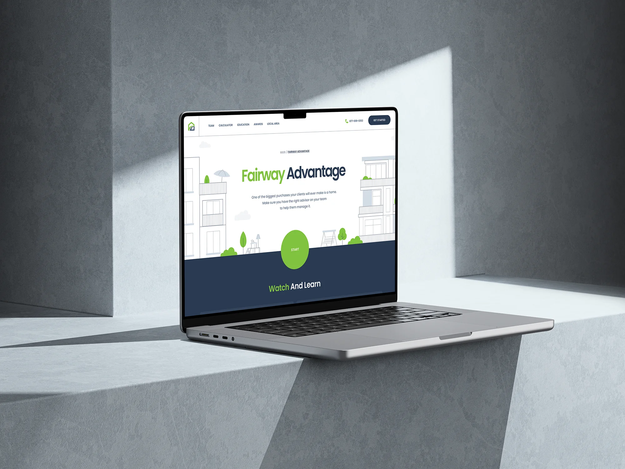
We were faced with the non-trivial task of creating a gamified lead generation website for one of the biggest mortgage companies in America called Fairway.
Inside this website the following interactive elements and functions should have been implemented:
- slider with the team, and their contacts
- individual landing page for each agent
- mortgage calculator with the ability to change the type of property and interest rate
- download a branded report in PDF format by email
- answer questions via FAQ
- demonstrate company awards
- provide information about restaurants, delivery, and moving services available near the user
- display reviews provided through Google Reviews
- create a hybrid mortgage quiz
- create pages with multi-format educational content

The customer provided us with:
- company branding
- team photos
- educational materials
- site page structure in Google Docs.
Solution
To develop a site of this scale, we needed to work out the skeleton of the site and all the sections and elements interconnected with each other in as much detail as possible. We created a sitemap in Figma and, using employer-provided Google Doc content, developed a prototype.
Fairway's branding was quite traditional and classic. It was developed many years ago, which is why some elements looked outdated. We needed to work on the font combinations and also modernize the colors a little so that they would look fresh and relevant on the website being created.

We suggested lightening the company's green color slightly and making the blue deeper, which would allow for impressive contrasts in the user interface. It was proposed to use the sans-serif font Poppins as the main font on the site, as it was very easy to read, neat, looked reliable, and modern.
After demonstrating Fairway's updated branding, we received approval and were able to move forward with creating the user interface for the site's home page.

In visuals, as well as interactive interface elements, we decided to use thin contour lines that created a friendly and playful atmosphere. We prepared illustrations of different types of houses and their surroundings created from scratch and also animated them in After Effects. In addition, we created interesting animations of fireworks that were played on the site after clicking on any company award.


To enhance the gamification effect and maximize user immersion in the process of interacting with the site, we decided to place some audio effects that were triggered when buttons and other interactive elements were clicked. The user also had the option to turn on background music, which our test group associated with The Sims.

We used Webflow to build this site, incorporating third-party code to add features such as a mortgage calculator with the ability to send a branded calculation via email (lead magnet), syncing of reviews with Google Reviews, and showcasing local services through Yelp linked to IP location, and others.

The mortgage calculator included a step-by-step tutorial to guide users through the process of obtaining a realistic calculation of their monthly payment for a desired property. Depending on the type of real estate selected, existing privileges (such as being an army veteran or first-time homebuyer), and the property's cost, the real estate illustration would dynamically change. For example, if the user was a veteran, an American flag would appear on the house illustration. If the user was a first-time homebuyer, boxes for moving would be displayed. Additionally, the home's image would become more premium as the property's value increased.

The hybrid quiz offered various user-flow options based on the user's answers. If a user accessed the quiz on their mortgage agent's recommendation, they would be prompted to fill out a mortgage application. If the user discovered the site independently, additional data would be collected for future transfer to a free agent.

Furthermore, if a potential client accessed the quiz page directly from an agent's page, all subsequent data entered would be exclusively sent to that agent. This ensured that any lead accessing the quiz through a mortgage agent's personal marketing would be assigned to that agent and not redirected elsewhere.


The following types of educational materials were used on the site: articles, videos, quotes, and podcasts. For the presentation of each type of material, we prepared unique pages, and all data was stored on a third-party server. They were displayed on Webflow pages through a special linking system created in CSV format.

Technology
In the design process, we utilized applications such as Miro, Figma, Adobe Illustrator, and Adobe After Effects. Webflow served as our development technology, complemented by custom JS, HTML, CSS, and PHP code. Data transfer from third-party services was achieved by connecting a specific service and Webflow via API.

Easter eggs
We are fans of high attention to detail. In this project, we included 2 nice "easter-eggs".
- You can "buy" a house by clicking on the "for sale" banner on the hero screen.
- You can make the cat, that lying on the roof to "Mew" if you click on it.
Try to find these cool stuff on the site by yourself 😊

Awards
CSSDA

CSSDA

CSSDA

CSSDA

WD Awards

Awwwards

About Digital Butlers
We’re Digital Butlers — a design-led team of 27 senior specialists building digital products since 2016. By choosing us, you’re getting results that are way different from what you already have — with the same commitment to your goals that Alfred has for Batman.
If you need a website, web service, or mobile app that pays off, reach out to us — we do it well.
Digital Butlers — a mature team with mature processes that deliver consistent results.


Let's discuss your project.
My name is Alex and I am your potential Digital Butler





.webp)


