

Vitable Health
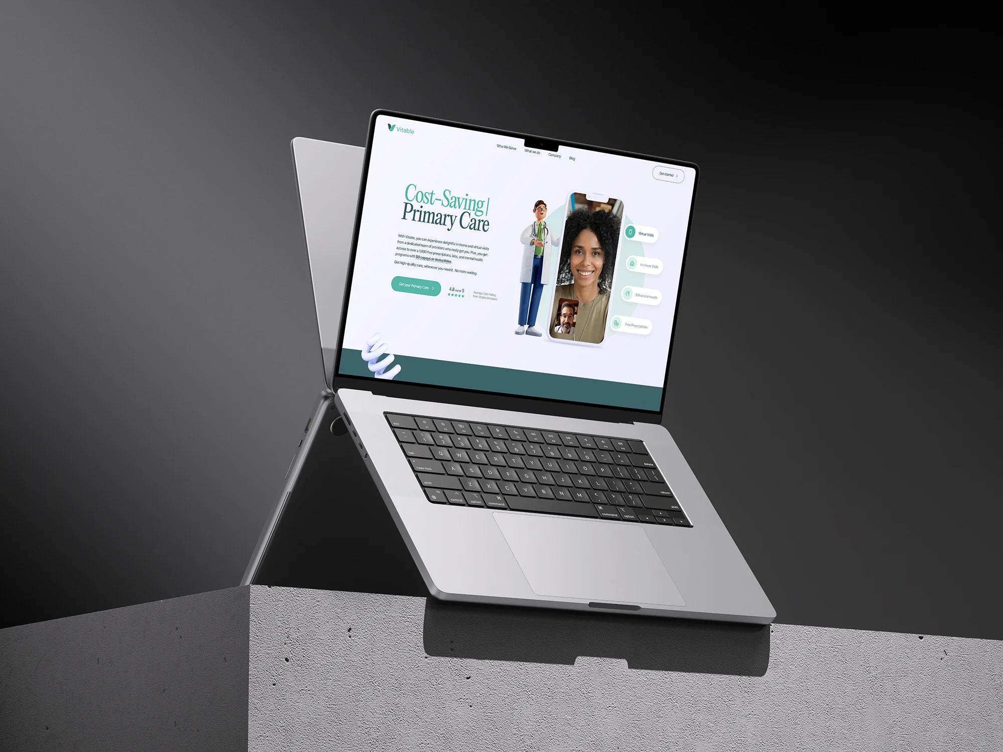
Ultra fast-loading⚡ & tech-looking corporate site for the Primary Care provider in the US 💊 3D objects, programming calculators, interactive US map, and much more


Project scope
Vitable Health is an enhanced Primary Care membership that makes it easy for US-based employees to get high-quality care. Delightful in-home and virtual visits from a dedicated team of providers. Vitable Health provides access to over 1,000 free prescriptions, labs, and a mental health program for employees and their families with no copays or deductibles.
Initially, Vitable Health approached us to design the user interface for their new website based on prepared prototypes. After successfully completing the design stage, the scope of the project expanded to include full development of the site on Webflow. This involved modeling and integrating 3D objects, programming calculators, and creating an interactive map of the USA.
The employer provided detailed prototypes of each page with text in Figma, as well as the company's brand book, Vitable app screenshots, and static renderings of doctor characters that we could incorporate into the design.

Solution
In order to start the design process, we needed to align on the stylistic direction for the interface design. The employer shared some websites that the Vitable team liked, and we also put together our own list of references that we believed were suitable from a design standpoint. After receiving feedback from the employer, we created a mood board for colors, fonts, shapes, and animations. We also developed a "do and don't" table, which served as a clear guideline for the design solutions that could and could not be used on the site.

Given that Vitable Health's Primary Health Care subscription relied on telemedicine, it was crucial to showcase this aspect on the website. This was achieved by incorporating static renderings of doctor characters seamlessly embedded in real stock photos relevant to the project's target audience. Additionally, as the company also offers home visits in its range of services, this solution aligns perfectly with Vitable's approach.


To reinforce the medical theme, the site utilized clean serif fonts for headings, as well as pastel pinks and shades of green to complement the company's branding.
Furthermore, to emphasize Vitable's innovative health insurance and services solution, we integrated 3D objects that rotated smoothly across various sections and were used to reinforce the meaning of certain blocks described in the text. The site also featured interactive animations with horizontal scrolling effects, background color changes, physics-based simulations, and text animations.

One of the most beloved blocks in terms of meaning, according to our team, is the second block of the main page. It addresses the health problems that individuals encounter throughout their lives, portraying these issues as unexpected bricks falling from the sky. This interactive section allows users to play around with the tags by tossing them in the air or dragging them.

We also appreciated the approach of transforming a negative concept (problem) into a positive one (solution) through horizontal scrolling and dynamic background/object colors. We used it in a few sections on the site and it was positively perceived by the employers’ team.


Upon completing the user interface design for both the desktop and mobile versions of the site, we shared the Figma file with our development department, who then implemented all planned elements on Webflow.

While our front-end developers were working on building the basic Webflow pages, our 3D developer was modeling and optimizing the necessary objects for later integration.


Once the main pages' layout was ready, we began animating elements, connecting the CMS system, and programming calculators. There were two calculators on the site: one for calculating the employer’s savings on health insurance, and the second for calculating the ACA penalty.


An interesting element on the site is a dynamic map of US states, which demonstrates the service's area of operation. It clearly identified states where "Virtual & In-Home Care" was available, states where only Telemedicine was available, and those parts of the country where the service would soon be available. This map was fully connected to Webflow CMS, making it easy to edit in the future during the project's development.

We have integrated a blog, cases, reviews, list of leadership team and investors, privacy policy and terms of use, medical package comparison table, and frequently asked questions into Webflow CMS for easy site management.

The site is fully responsive for all modern devices and browsers, and the use of Web worker technology has allowed us to efficiently integrate 3D models without affecting loading speed. Despite the animation effects, models, and scripts, the site pages load in 1-2 seconds.
Technology
In the process of creating the site, programs such as Figma, Blender, and Adobe After Effects were used. The site engine was the Webflow platform with the addition of custom CSS, and HTML JS code. To animate and integrate 3D models, WebGL technology was used, as well as the Three.js library.

Awards
About Digital Butlers
We’re Digital Butlers — a design-led team of 27 senior specialists building digital products since 2016. By choosing us, you’re getting results that are way different from what you already have — with the same commitment to your goals that Alfred has for Batman.
If you need a website, web service, or mobile app that pays off, reach out to us — we do it well.
Digital Butlers — a mature team with mature processes that deliver consistent results.


Let's discuss your project.
My name is Alex and I am your potential Digital Butler


.webp)
