

PeechPay
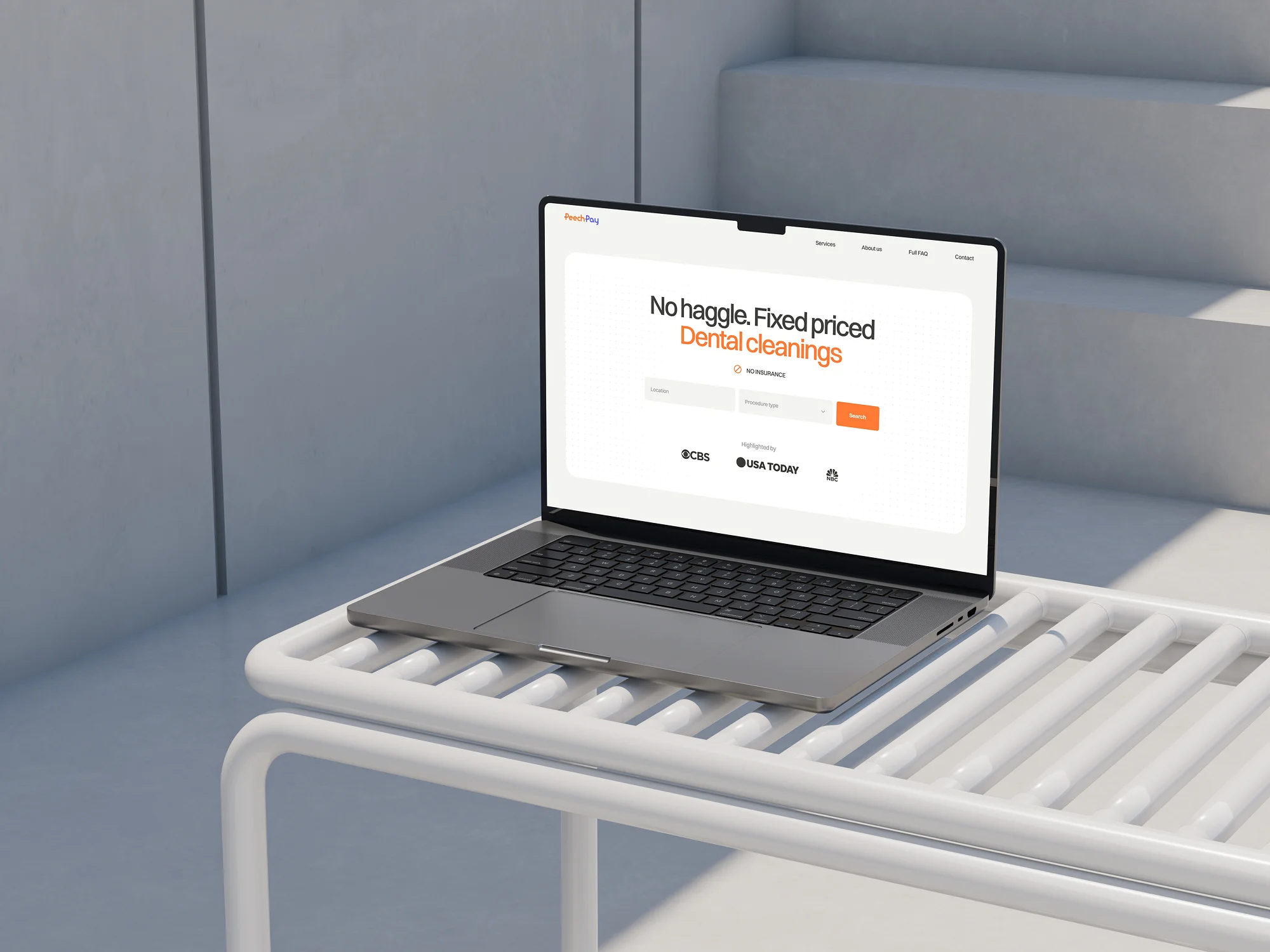
PeechPay is a swiftly deployed MVP platform that connects users with affordable medical and beauty services without requiring insurance. The platform allows users to filter service providers by location, price, and language for seamless booking.


Request / Problem
The employer approached us to develop a digital platform that would act as an aggregator of medical and beauty services. The platform’s primary aim was to enable users to find and book treatments such as dental cleanings, Botox injections, skin rejuvenation, and other health and beauty services without needing insurance. Given the limited budget and the urgency to launch quickly, the project required a Minimum Viable Product (MVP) that would allow for essential user interactions, such as searching for services by location, comparing prices, and viewing provider profiles. The employer needed a platform that could be rapidly tested in the market and later expanded with additional features based on user feedback.

Solution
Our solution was designed in several phases, ensuring that the core functionality was prioritized and delivered efficiently.
1. Initial Discovery and Requirements Filtering:
The project began with in-depth discussions to outline the desired functionalities. We worked closely with the employer to filter out features that were not critical for the MVP stage, focusing on what would bring immediate value to the users. These essential features included:
- Search Functionality: Users could search for medical and beauty services based on location and service type.
- Filter Options: Users could filter providers by price and language spoken by the service provider.
- Provider Profiles: Each medical or beauty expert had a detailed profile that included:
a. A description of services provided.
b. Pricing details for various procedures.
c. Doctor's language proficiency.
d. Video introductions or explanations about the procedures offered.
e. Doctor's qualifications and answers to frequently asked questions. - Booking System: Users could directly book services from the doctor’s profile, ensuring a smooth end-to-end experience.

2. UI/UX Design:
Our design team focused on creating a clean, modern, and user-friendly interface that would build trust and offer a seamless experience for the platform’s users. Key design elements included:
- A straightforward homepage with a two-field search (location and desired service).
- Clear navigation across service categories and provider profiles.
- A responsive, minimalistic design that catered to users across various devices.
- Custom illustrations and animations to create a modern, reliable, and professional feel, ensuring the platform’s visual appeal resonated with the target audience.
Additionally, we developed a comprehensive UI kit, detailing the stylistic elements, fonts, color schemes, and button styles to ensure design consistency throughout the platform.


3. Development and Technology Implementation:
For the technical execution, we focused on delivering a robust MVP within the constrained budget while ensuring scalability for future expansion.
- Front-end with Webflow CMS: We selected Webflow CMS for its ease of use, allowing the employer to manage doctor profiles, service descriptions, and locations efficiently. Webflow’s CMS enabled non-technical users to edit and update content regularly, which was a key requirement for the platform’s dynamic nature.
- Back-end Development: We developed lightweight custom scripts and a basic database that integrated seamlessly with Webflow. This allowed the service provider catalog to be updated dynamically and ensured the booking system operated smoothly.
- Scalability: The architecture was designed to allow for future feature expansions such as user reviews, insurance support, and enhanced search algorithms without needing a complete platform overhaul.

4. Testing and Launch:
After the development and design phases were completed, we conducted thorough testing to ensure the platform was fully functional and provided a seamless experience. Testing covered:
- Usability: Ensuring users could navigate, search, filter, and book services effortlessly.
- Responsiveness: Verifying that the platform worked across different screen sizes and devices.
- Performance: Optimizing the platform to load quickly, even with high-resolution images and videos on the provider profiles.


5. Post-launch and Future Plans:
The MVP was successfully launched, providing users with access to a growing catalog of medical and beauty service providers. With the platform live, it now has a solid foundation for future growth. The employer plans to gradually introduce new features, such as enhanced provider verification, user reviews, and integration with third-party services like payment gateways and insurance options. The platform is gaining traction and continues to evolve, with plans to update its functionalities and improve the overall user experience based on feedback from early adopters.

Technology
- Front-End: Built using Webflow CMS, allowing easy updates and content management.
- Back-End: Custom scripts and a lightweight database integrated with the Webflow CMS, facilitating dynamic updates to provider profiles, locations, and pricing.
- Design Tools: Used Figma and Adobe Illustrator for UI/UX design and illustration work.
%25201-min.jpeg)
Awards
About Digital Butlers
We’re Digital Butlers — a design-led team of 27 senior specialists building digital products since 2016. By choosing us, you’re getting results that are way different from what you already have — with the same commitment to your goals that Alfred has for Batman.
If you need a website, web service, or mobile app that pays off, reach out to us — we do it well.
Digital Butlers — a mature team with mature processes that deliver consistent results.


Let's discuss your project.
My name is Alex and I am your potential Digital Butler


.webp)
.webp)


