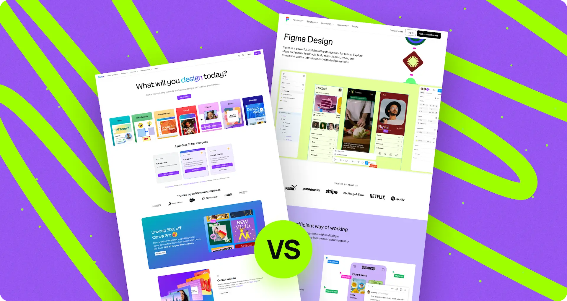
Webflow for landing pages
“Do I need a landing page? What for?...”
If you are facing such questions, then, most likely, you need a landing page. First, you need to know what a landing page is.


Crafting Effective Landing Page for Your Business
A specific webpage is designed to grab the visitor’s attention, promote a product or service, and then encourage them to take a desired action.
And here we go, Webflow is a solution for everyone who dreams of an unusual and highly-selling landing page with a “wow” effect. Let's explore the reasons and clarify any uncertainties.
Why do WE recommend you to have a landing page for your business?
Landing pages are good for supporting your marketing campaigns, where you can easily place your contact, services, or product information and company details. Landing pages should be designed in a way that attracts visitors’ attention and makes them take action, such as clicking, making an order, registering for your SAAS service, or an event, and subscription to the newsletter. Landing pages are designed with a single focus or goal that helps you target your audience and highlight a specific product or service. Focus on a single group of products or services at most. Such pages will never help you achieve a significant volume of sales in your online store because of the thousands of goods appearing there.
Keep this in mind! If you sell a large number of goods or provide numerous services, you’d better choose one good or service for your landing page.
Here is an example from our experience:
One of our employers operates a small online store for the sale of underfloor heating and accessories for them, with a range of 120-150 commodity units. Once he managed to negotiate a substantial discount with a distributor for one of the brands, the margin from the sale of this underfloor heating equaled 2-3 times the sales of underfloor heating from other brands.
We created a landing page on which we described in detail all the advantages of underfloor heating from this brand, and the profit from this landing page for the next 7 months was 20-40% of the profit that the entire online store with less profitable goods generated.
Сonclusion: A product card in an online store is incomparable to a landing page in terms of conversion.
THREE best scenarios from the US when you need to have a landing page:
• Better company tracking
Landing pages allow you to track the performance of specific campaigns or promotions more effectively, enabling you to measure success and make data-driven decisions.
• Audience segmentation
Landing pages can be useful to differentiate among segments of your audience, ensuring that you provide relevant content, and offers to specific groups.
• Clear and improved user experience
Landing pages eliminate distractions, allowing the user to focus only on what he is looking for; they maintain his engagement by presenting everything on the main page.
How do you understand that your landing page works well?
- • Engagement
Monitoring engagement such as Average Time on Page, Bounce Rate, Goal Completions, and interactions with interactive elements (like quizzes or polls) can help figure out the level of interest and engagement your landing page generates. If 80% of your visitors give up scrolling your page within 3-5 seconds, it means that you have chosen an ineffective strategy. - • Your goal achieved
The success of your landing page is ultimately determined by whether it helps you achieve your goal, where your business and sales are increasing, and you are not selling at a loss. The landing page converts, and your calculations align with business!
“Don't make the mistake of judging the effectiveness of a landing page solely by adding up all the marketing tools that bring visitors to it.”
The effectiveness of your page is measured for each marketing campaign separately! We keep the ones that can bring us good results, and we turn off the non-operative ones. If you don’t have any profitable marketing campaigns, the issue may lie with your targeting specialist or your page. Why don’t we give it a test to figure out the reason?
Landing pages are modern and up to date with Webflow
Today, many online businesses have their landing page. The Internet is full of landing pages with similar looks and functionality. The competition has never been so high before! Even a page for a local cafeteria meets certain criteria and should fit perfectly into modern standards in order to stand out among the competition and win its audience.
The possibilities to create a perfect landing page on Webflow are practically endless, but that's not the only advantage!
How to create a landing page and why Webflow is good: Essential steps for success
1. Idea
“Ideas are more powerful than guns. We would not let our enemies have guns, why should we let them have ideas.”
Ideas are the most powerful tool of all time. This quote highlights the influential nature of ideas, suggesting that they possess a greater potential for impact and change than even weapons. Our weapon is Webflow, but without having any idea, we won’t be able to use it properly, inspirationally, and creatively. So, putting aside the philosophy, let’s make ideas for our future landing page first!
For example:
Browsing through websites/landing pages with the same topics such as delivery, carsharing service, or travel blogs, and getting inspired by their design is BAD! The essential difference of the landing page is in terms of conversion, not appearance. There is a myth that a landing page can be made by copying from another – IT’S A MISTAKE, you will copy the non-operational project.
Make the structure of your landing page on your own. After all, no one knows your audience better than you.
Landing page is a marketing tool and you need to start making it from a marketing point of view. We will talk about it in the next Creation.
2. Creation
Creation with Webflow is easy and speeds up the process of launching your new landing page, making it more enjoyable. It’s particularly suitable for beginners and those who are not keen on learning how to code but for those who want to create outstanding websites using a powerful editor. Moreover, we can assist you in designing and launching!
Sketches
- Describe the portrait of your target audience
- Make a list of User Stories, like this:
• The user wants to make sure that they’ve arrived at the website where they can purchase the product they were looking for or order a service.
• The user wants to get several benefits from buying or ordering services on this site and needs to know what must be done to obtain these benefits.
• The user wants to see the product/service itself to explore and choose the one they desire.
• The user wants to make sure that they have chosen the best model, and in the case of a service, they want to be certain that you can fulfill the terms.
• The user wants to make sure that they can trust you and avoid making the wrong choice.
• The user wants to know how to make an order and not mess up with the purchase. Write down everything that you think is important to your user: all his fears, desires, and “pains”. - Arrange your list based on your own experience > test it with your team > conduct your research with a real client to know how it will fall out of reality.
- Write next to each User Story how exactly you will give the user what he wants.
- Create a prototype using Google Docs, playing with Mind Maps, or on a piece of paper and coordinate with your team.
HEADLINES that contain benefits and offers
The headline on the main screen is the first thing that a guest sees on your page. It greatly influences whether the user closes the webpage immediately or continues scrolling. Your captions should speak the language of benefits and offers to catch their eye.
Make your headlines catchy and meaningful; this will help the viewer understand that they’ve landed on the right page. Try to fit the keywords of the topic into the title, like: “How to peel potatoes with your mind in 30 seconds without taking your eye off Netflix”.
Photos/Videos(later) and titles are the biggest elements on your page. So, you need to write the benefits and advantages that the user receives in them; otherwise, they will never know about them. Make an offer that won’t be missed.
Instead of “About Us” – “Our Team of 9 Dance Champions Teach Your Child to Dance in Just 3 Months!”
OR
“Terms of delivery” – “Get Free Delivery on Purchases Over $99!”
Good Sign! Create a section with reviews about your products/services or show your rating on a trusted platform.
It’s of vital importance to have readable and suitable headlines for your overall design on your landing page. You can use default fonts or you can add your ones to Webflow. Try it yourself!
Impeccable grammar
You should always remember that the landing page represents the face of your brand, and you are creating it for people. Mistakes or typos are not acceptable if you don’t want people to get the wrong impression about your marque. If you prefer not to spend time connecting a spelling and grammar checker to Webflow to have everything in one place, you can use other services like Apple Pages, Google Docs, or MS Word and Grammarly(a special service that checks your grammar and typos). Perhaps, this is one of the obvious drawbacks of Webflow.
BUTTONS and call-to-actions should stand out
We already know that landing pages were invented to attract visitors’ attention to encourage them to take action. All buttons should not only look harmonious with other important elements of the page but also stand out! On Webflow you have a rich palette of colors to choose the most preferable.
For example:
Orange or red buttons can catch a viewer’s eye. People psychologically seek buttons like “FREE”, “BUY”, “DOWNLOAD” or “NEW”, which should be big, noticeable, meaningful, and placed coherently so that users don't need to scroll to find them.
Remember that your buttons should align with the main idea that you want to convey. For instance, If you’re offering a free PDF file on your learning platform, name the button “Download for PDF for free”. Consider the logic behind naming carefully.
Your buttons should look unobtrusively and attractively. In the Webflow community, you can find inspiration from thousands of gorgeous templates and clone them into your project.
Limit the number of links
A large number of links gives the impression that we are on the homepage or website, and it can distract the user from our main goal — to SELL our service. The beauty lies in its simplicity!
Remember to mention your social networks carefully!
Once someone goes on your Instagram, the user can switch to watching stories of their friends and forget about you. After all, Instagram will show similar contextual ads, and your competitors can have a better portfolio, whereby you can lose your client.
Let's learn how to add some pictures and videos
The customer wants to ensure that they have reached the webpage they need. Including a picture of a product or a thematic picture of your service can be helpful. People want to be certain that they can trust you. Create a block on your page with photos of your team, including individual photos of everyone + give a group photo to show that you are all real, and the photos are not taken from Google.
Appropriately sized and proportionally placed images can bring your page to life. Images are the second thing the user sees during a quick glance. Give those pictures a little squeeze to make them smaller because the loading time of your page can take ages and people will quit. Try this service to optimize your visuals ”https://tinypng.com/”.
Videos can provide a unique experience. With just one video you can tell the whole story about your marque, and a complex, deeply built website is no longer necessary.
The most optimal solution is a pitch video. In a 1-3 minute video you can tell about everything that you might have written on your website. Many people prefer watching a short video instead of reading.
You can always insert videos and images in your designs and template pages on Webflow. Unfortunately, there are no built-in image editors; you have to use separate software for that.
We have a fantastic example for you, demonstrating how it works on our page. Feel free to scroll down a bit.
Keep it above the fold
Design your landing page so that the main information about your product or service is visible on the screen without requiring scrolling. People often click numerous links in Google to find what they’re looking for, and your page can appear among these dozens of options. Arrange everything in a way that the viewer can catch the main points at once.
The first 3, 6 and 15 seconds spent on your page are the most important (these are typical variables depending on the service, marketing, or product). If you notice that the customer closes it within 3 seconds, you should work on your main page to extend their stay to at least 6 seconds.
The main page is the answers to the questions:
• Did I get where I need to?
• Does this product or service meet my selection criteria?
• What are my benefits and advantages?
• What should I do to get these benefits?
Webflow presents a bunch of templates for this purpose, and you can customize them after to match your desired look. Have you coped with the task? Let’s move on!
There are so many criteria to create a good landing page, and Webflow is coping with this very well, offering a great deal of tools to make it a reality.
3. Customization
It’s the art of customizing your brand-new landing page. Customize fonts, colors, sizes, and spacing to match your design vision. You're not just modifying a template – you're making it uniquely yours! All of this work can be done on Webflow, conveniently in one place.
Customize the presentation of your content to ensure it's visually appealing and functional. Webflow offers a great deal of tools to make it incredible, just connect your imagination.
You can also add surveys and quizzes to your landing page to make it more interactive and engage someone’s attention. A well-structured quiz can help your target audience understand what they need.
Quizzes can provide you with valuable customer insights that allow you to refine your marketing strategies and tailor your offerings to meet specific demands. This targeted approach can lead to better resource allocation and more efficient marketing campaigns, ultimately saving you money.
By knowing your target audience we can make a good quiz!
There are TREE types of actions that users can take on the page:
• Call
The most stressful part! Conversion is low because people can call at the final stage of choosing a purchase and are ready to make an order.
• Send a message (via email, Messenger, etc.)
It can also be stressful because we have to speak to a real person, which can take time.
• Submit your application
It’s both the easiest and most challenging action at the same time. You don’t need to speak to anyone; you simply make an order and receive your product or service. However, you need to search for answers to your questions yourself to choose exactly what you need.
And then the quiz appears. This is a way for the user to receive a replacement or analog consultation without having to communicate with anyone. Due to a quiz, the customer can have a customized and comprehensive answer.
The Rule:
Don’t start with complicated questions and don’t reveal your ace in the hole right away. After the quiz, redirect the user to the page with specific information about the product or service, and explain how their life will improve after purchasing with us.
After the compilation of the purchase offer the customer the option to send an invoice and additional information about your service, which is inevitably related to the purchase, via Email or Messenger.
Assess the functionality of your structure by comparing it to ours through the provided link.
You're familiar with the THANK YOU page, right? Just in case, We’d like to note that this is the page that the user sees after they've taken a key action on the site, such as submitting a request. The importance of this page can't be overstated:
• This is the primary tool for Google Analytics. Specify this page as the achievement of the goal, and when you collect enough statistics, Google will turn on its intelligence to bring more and more people to your site who are more likely to leave a hare.
• This is a way to “seal the deal”. How often have you encountered a situation where, after calling back or responding to an inquiry, a person acts as if they never submitted any inquiry? It can be frustrating, right? Consider placing an additional offer on your THANK YOU page, something that wasn't there before – another compelling reason to buy from you or schedule a consultation.
• Collect only the essential information on your page! A big filling form can be difficult and scary. Instead, request only vital details during the initial interaction. You can gather additional information on your THANK YOU page, where you can offer a personalized touch.
For example:
Ask for the recipient's name for a cost calculation letter.
“And if you'd like to receive our exclusive offers via WhatsApp, just drop in your phone number. As a thank-you, we'll send you a special 10% discount coupon for … “.
Look at how we do that
Step 1. IDEA. Any action begins with an idea and the quiz is no exception. Check out how we approached the description of the idea of the first step for the quiz on our website, which we are currently doing.
4. Adjustment and Optimization
Adjust your landing page for different screens and devices.
Adjustment and optimization allow you to make your landing page appealing and comfortable to read on mobile phones or tablets. Make sure that all animations are smooth and look extremely effective, consistent, and transparent. While Webflow allows you to create gorgeous animations, many people forget to pay attention to the details.
Webflow provides responsive design capabilities, allowing you to create a layout that adapts and looks great on various screen sizes, including desktops, tablets, and mobile phones.
Here's a secret for you. Try iPad PRO’s resolution of 1034x1366 pixels and make sure everything looks good there. The fact is, Wefblow perceives this resolution as a small laptop, which can lead to issues. Laptops and tablets interact differently; for example, laptops have hover effects, but tablets lack a mouse cursor. Don't forget to check :)
Remember when I mentioned the bounce rate and if most users close the page within 3 seconds? You should focus on the main page. Well, make sure your webpage loads quickly enough to capture the user's attention :).
Check your loading speed Page Speed Isights.
If it’s slow, you can’t publish your webpage!
Look at how we did that
Web developers with a reputation 4.9 out of 5 (https://www.digitalbutlers.team/)
After completing the main stage of site development, we encountered the issue that our PageSpeed Performance indicators were poor. To provide specific figures, our initial PageSpeed score was 28 points.

From now on, we will focus on the results of the mobile version only, as it tends to be more stringent, and currently, a majority of our website visits come from mobile devices.
Solution
After a few moments of reflection, a solution was found!
First of all, we moved some styles directly to HTML code. This adjustment reduced the number of times the content changes its petition during the loading of the page. It was the solution that helped to slightly improve the Cumulative Layout Shift indicator (A lower CLS value indicates fewer instances where the page layout changes the loading process, thus enabling users to interact with the site more smoothly even while it's still loading). We got a small increase:

Our next step was to disable the preloader. It was useful to improve the Total Blocking Time indicator. This indicator is responsible for how quickly the page becomes interactive.

Then, we added smart lazy loading for a video — +3 points.

And then we got into a kind of dead end. After that moment there was nothing to optimize. We turned the preloader back on because, without it, the page did not look particularly presentable at the loading stage.
We've exhausted the ideas for optimization without compromising the website's integrity. As a next step, we decided to eliminate the decorative image on the main page. This led to a significant reduction in the Largest Contentful Paint (LCP) indicator, which directly influences the loading speed of the primary content on the page.

After that, we tried to disable all animations. This is a matter of an increase of a couple of points, but in the end, we decided to include them back, because they significantly improved the appearance of the whole page.

Just to make it clear, the addition and removal of elements on the website have no direct impact on the points, but they do affect metrics such as First Contentful Paint, Largest Contentful Paint, etc. These metrics contribute to the resulting score in points. After enhancing certain elements, pursuing further optimization for other elements might not yield significant improvements, making it more sensible to retain the original design.
To determine which metrics should take priority in optimization efforts, we rely on a calculator. This tool helps us understand which values are most crucial to address initially, ensuring a focused and effective optimization strategy.

The final stage is the minification of scripts, styles and page markup, which gave us 9 points.

This was the end of our optimization efforts. Thus, we have achieved an increase by 2.5 times (+ 37 points in total), increasing the download speed by 8 seconds (with a 3G connection), while not deviating much from the original design concept.
AND NOW?
Analytics have been added to the site and functionality has been expanded. Despite these changes, our page remains well-optimized, achieving a score of 60 points on the mobile version. The benefit of optimization is in its search engine visibility which allows us to use it without any problems.


It's also worth remarking that on the desktop version of the main page, we used loads of 3D elements, which present a huge challenge for optimization. Nevertheless, even with these complexities, the score is 70 points.
We are satisfied with these indicators. They may not be perfect, but for us, it's a compromise. The main goal of our main page, designed according to the landing rules I mentioned earlier, is to demonstrate that we can make creative websites!
MUST-READ
We recommend that you explore our other collection of write-ups about Webflow to learn more about its advantages and how this web builder platform can help you create amazing things.
Feel free to get in touch with us so that we can provide personal assistance for you!

Set a goal and we will organize the process of achieving it

Similar articles
We write just a few articles per month, but in each one, we pour our time, passion, and expertise.


.webp)


.webp)

.webp)

.webp)
